Intro
About Me
The Manifesto
Previous Posts
The "special assignment" plural apostrophe-S
Well, in Proto-Indo-European...
(Within ten feet of this cube)
Proximity misconjugation
And stoves will be called "kenmores"
Wordsong
Lies, damned lies, and etymologies
On mispelling
Return of the Paper Paradigm
Quest for the Answer Mark Part II:Exclamations and...
Back to Main
Delicious
Links
Bartleby
Common Errors in English
Netvibes RSS Reader
Online Etymology Dictionary
Research and Documentation
The Phrase Finder
The Trouble with EM 'n EN
A Capital Idea
Arrant Pedantry
Blogslot
Bradshaw of the Future
Bremer Sprachblog
Dictionary Evangelist
Double-Tongued Dictionary
Editrix
English, Jack
Fritinancy
Futility Closet - Language
Language Hat
Language Log
Mighty Red Pen
Motivated Grammar
Omniglot
OUPblog - Lexicography
Style & Substance
The Editor's Desk
The Engine Room
Tongue-Tied
Tenser, said the Tensor
Watch Yer Language
Word Spy
You Don't Say
Dan's Webpage
Of points and picas
Sunday, May 6, 2007 10:17 PM
Think reactive, not reactionary
Sunday, May 6, 2007 10:17 PM
I find that writing my notes in layout jargon (e.g. text_1 rather than the first paragraph) reduces the number of errors I find on the second pass. Much easier than having layout learn my language.
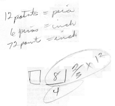
I probably wouldn't go this far, but recently one of the more senior layout people took a few minutes to explain points and picas to me. She also said that, from what she's seen, the capital letter in a font seems to be 2/3 of the point size in height and the lowercase letters will reduce to 1/3.
Here's her sketch, with charming floating I-dots:

On the rare occasions where I've needed exact measurements, our company has printed a variety of rulers out on a transparency so that you can take measurements from docs set at 100%.
[Update: apparently these are known here as acetates. Metonymy!]
I probably wouldn't go this far, but recently one of the more senior layout people took a few minutes to explain points and picas to me. She also said that, from what she's seen, the capital letter in a font seems to be 2/3 of the point size in height and the lowercase letters will reduce to 1/3.
Here's her sketch, with charming floating I-dots:

On the rare occasions where I've needed exact measurements, our company has printed a variety of rulers out on a transparency so that you can take measurements from docs set at 100%.
[Update: apparently these are known here as acetates. Metonymy!]
Labels: layout
Ah, yes. The old pica/point/inch nexus. It's very interesting indeed. We should get drunk and discuss this all sometime. Especially when you trough leading into the mix, it's a wild, wild world.
posted by  Graham at
May 7, 2007 2:07 PM
 Graham at
May 7, 2007 2:07 PM
Think reactive, not reactionary


